01 / Flagship product · 2026–Present
Junior Quest
From an overwhelming catalogue to a family’s next outing. I designed and built this working discovery application, owning the information architecture, interface system and responsive implementation as a contract UI/UX Designer & App Builder.
View live site — juniorquests.com- Role
- Contract UI/UX Designer & App Builder
- Engagement
- 2026–Present
- Ownership
- UX → interface → implementation
- Product
- Family discovery · responsive web
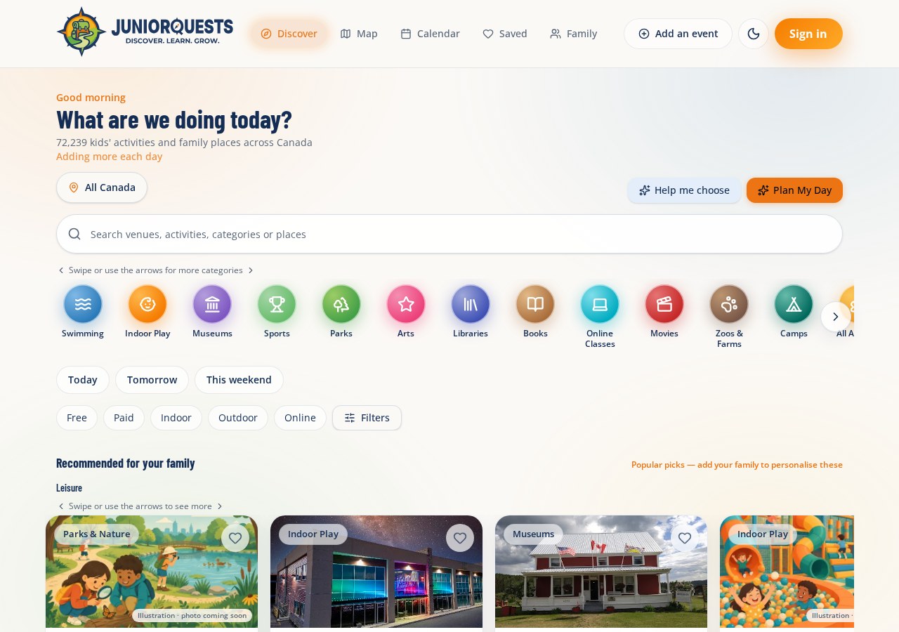
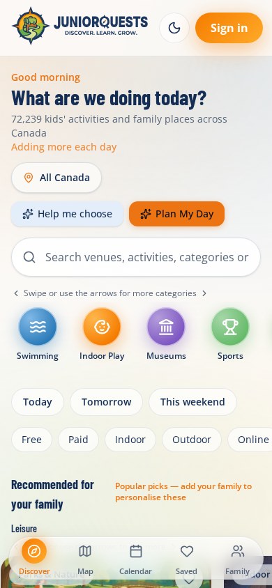
01 / Problem
Finding a family outing is a matching problem: location, children’s ages, date, cost and indoor or outdoor preferences all matter at once. Venue pages, social posts and a flat activity list leave parents to do that matching themselves.
Junior Quest turns those constraints into navigable choices. The work began around Ontario family activities; the current interface also exposes places across Canada. Dated programmes and place listings have different coverage and are not presented as equally complete.
02 / Constraints
- A mixed catalogue: recurring places and dated programmes need different time, price and availability context.
- Mobile browsing needs quick decisions without hiding the depth of category, location and age filtering.
- Not every listing has photography. Illustrated placeholders must not be mistaken for real venue photos.
- Public discovery and personal saved plans have different account requirements. Sign-in should appear at the appropriate boundary.
03 / My role
I work as the contract UI/UX Designer & App Builder, 2026–Present. I personally designed and built the application: navigation and flows, the visual component system and the responsive product screens.
- Information architecture across Discover, Map, Calendar, Saved and Family.
- Structured location/category pages, discovery filters, geographic browsing and the Plan My Day constraint-setting flow.
- Venue and event submission paths, family preferences and notification interfaces.
- Implementation decisions carried through into the working product, rather than stopping at a static handoff.
04 / Design process
I structured discovery around the questions a parent needs answered: what is nearby, when is it available, does it fit my children, and what will it cost? These questions became the hierarchy of location, search, categories and filters.
I separated browsing, geographic exploration and personal planning into distinct destinations, then used shared navigation and activity cards to connect them. The screens below show the resulting design decisions, not evidence of a usability study or a measured outcome.
- Information architecture → navigation and task flows.
- Interface patterns → shared cards, controls and semantic tokens.
- Responsive build → working screens and state boundaries.
- Review → identify coverage gaps, missing photography and performance questions that still require validation.
05 / Layout decisions
- Discover: lead with the family’s next decision; keep frequent filters close to search and reserve a panel for deeper options.
- Map: a desktop map/list split becomes a vertical mobile sequence. Marker clusters and an explicit Search this area action manage geographic density.
- Calendar: month and agenda modes serve orientation and detail. The seven-column grid uses square date cells; signed-out families see a focused explanation rather than an empty personal calendar.
- Plan My Day: a scroll-contained dialog sequences When, Who and How, then expands its desktop width for results. Location and travel constraints are explicit before generation.
- Navigation: desktop top links become a five-destination bottom bar on mobile, retaining the same order and labels.
06 / Interface
Four real screen states are available below in desktop and mobile views. The calendar capture is deliberately shown signed out; its authenticated month/agenda implementation is verified in the source, not substituted with an invented screen.
Explore the actual screens and decision annotations ↓07 / Engineering & performance
The implementation bridges design and engineering: React 19 components, typed data, file-based routing and semantic visual tokens keep the interface connected to working application states.
- Implemented foundation: React 19, TypeScript and Tailwind CSS 4; TanStack Router for the file-based navigation.
- Mapping: Google Maps is the primary code path, with a lazy-loaded Leaflet / React-Leaflet fallback. The live capture here shows that fallback—not merely an installed mapping package.
- Data and accounts: @supabase/supabase-js is declared and a typed client is instantiated. Authentication and calendar data hooks are present; this is source evidence, not an authenticated end-to-end test of all account features.
- Components: local Radix-backed UI components with class-variance-authority; Lucide icons, date-fns calendar calculations and Sonner feedback are used in the source.
- Source-observed performance choices: lazy-loaded map components, clustered map markers and a paged discovery feed. These are implementation strategies, not benchmark results.
Performance test results pending verification
Validation methodology: measure cold and repeat loads on a mid-range phone with a defined network profile; exercise search, filters and map bounds against the real catalogue; test rapid filter changes, failed requests and long-result scrolling; record LCP, INP, CLS and memory alongside the device, dataset and run count. No stress test, load test or synthetic score is claimed.
08 / Proof & limits
The proof is a shipped, publicly accessible application and authentic interface captures. The case study’s colour, typography and implementation details were checked against the actual app source on October 21, 2026.
Public Discover and Map views were opened, and the Plan My Day form was exercised for these captures. Personal calendar and family data were not accessed. No user-study findings, adoption figures, conversion rates, performance scores or causal outcomes are claimed.
09 / Reflection
The central design trade-off is depth versus confidence: a large catalogue is only useful when a family can understand relevance and trust the detail. Keeping data limitations visible is part of the interface, not an afterthought.
The next validation priorities are whether families can narrow a shortlist without backtracking, whether map and list context stays understandable on a phone, and whether planning inputs lead to a practical itinerary. Those questions need observed use and measured tests—not invented proof.
Deliverables
- Information architecture and task flows
- Semantic design tokens and reusable UI
- Discovery, map and planning interfaces
- Responsive desktop and mobile implementation
- Venue and event submission flows
- Family, calendar and notification interfaces
What this work demonstrates
- End-to-end ownership of a working digital product.
- Product judgement across discovery, planning and account boundaries.
- A design system carried into code, not just a presentation.
- A clear distinction between shipped work, source evidence and unverified outcomes.
Interface · Actual product captures / October 21, 2026
The decisions, in the interface.
Start with a parent's decision, not the catalogue.
01 · Establish context
Location sits beside the main question. Search and date, cost, age and category filters turn a broad catalogue into a relevant shortlist.
02 · Reveal complexity gradually
Category shortcuts and common quick filters stay visible; detailed options move into a Filters panel rather than competing with the first decision.
03 · Preserve orientation
Desktop navigation and the mobile bottom bar keep Discover, Map, Calendar, Saved and Family in a consistent order.
Source-verified
Design system
A recognisable family product, supported by reusable semantic tokens. Orange marks actions, navy anchors hierarchy, and dedicated success and free-programme colours carry meaning beyond decoration.
Brand navy
--navyoklch(0.3 0.077 258)Primary / action
--primaryoklch(0.687 0.174 51)Verified / success
--questoklch(0.7 0.163 145)Free programmes
--freeoklch(0.842 0.162 84)Light background
--background#FBF9F6
Headings · Barlow Condensed
What are we doing today?
Body · Open Sans
Find activities that fit your family, your location and your day.
Typeface specimen, not additional product copy.
- Base type
- 16px body · 1.55 line-height
- Radius scale
- 0.9rem base; derived −4px, −2px, +4px, +8px, +12px, +16px
- Layout container
- 72rem maximum · 1rem inline inset
Exact light-theme values and font definitions from the Junior Quests stylesheet, reviewed October 21, 2026. The product also defines a separate dark theme. Spacing is applied per screen; no invented global spacing scale is claimed.
Junior Quest is the résumé-facing name; the live site and captured interface retain Junior Quests branding. Current contract work. Live product screens and source-verified implementation; future validation is clearly separated from completed work.